


A modern magazine bridging everyday culture and sustainable living.
Rather than preaching perfection, Opal offers grounded, solutions-focused stories that meet readers where they are. The magazine blends science, storytelling, and design to reframe sustainability as a cultural conversation anyone can be part of.
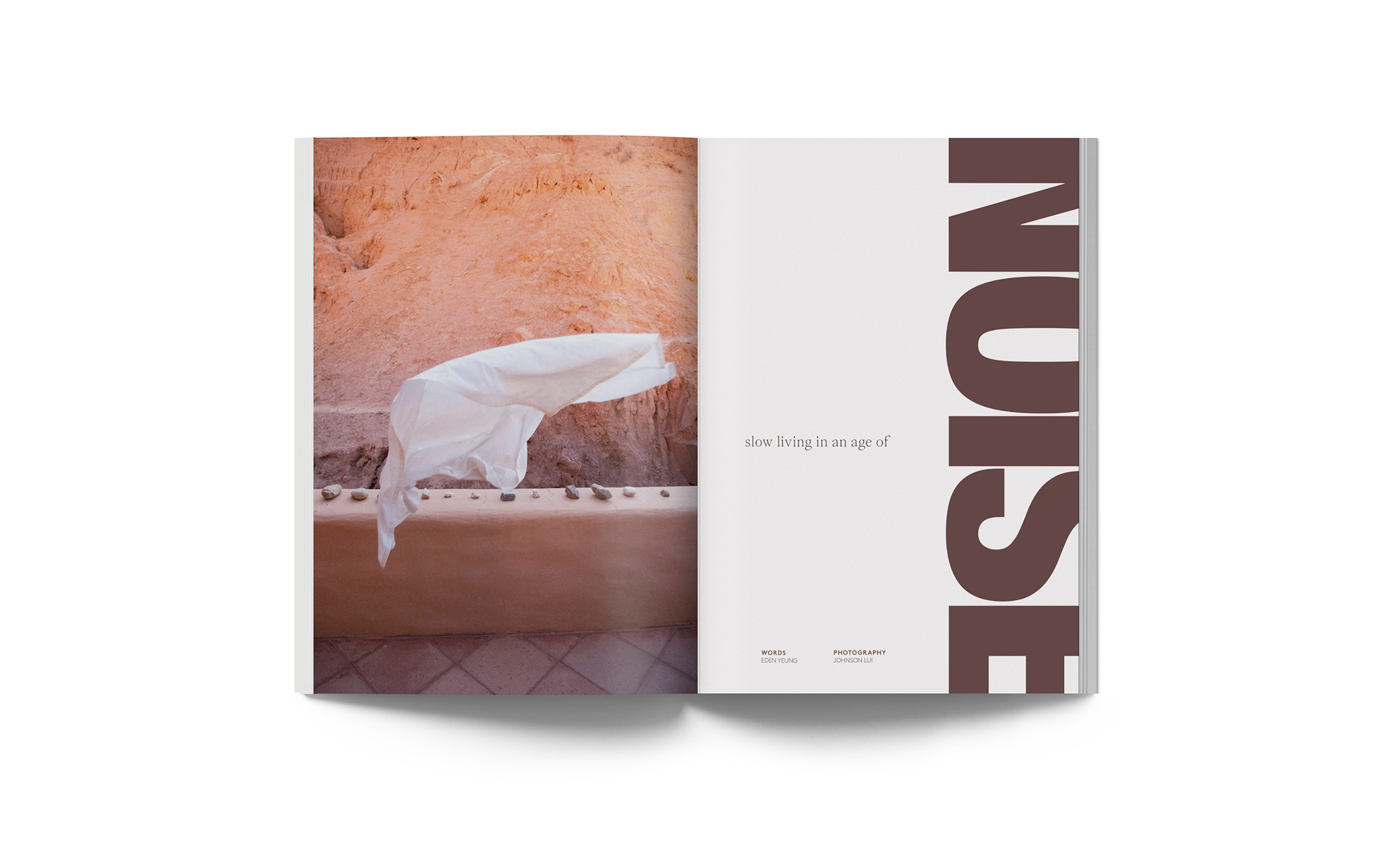
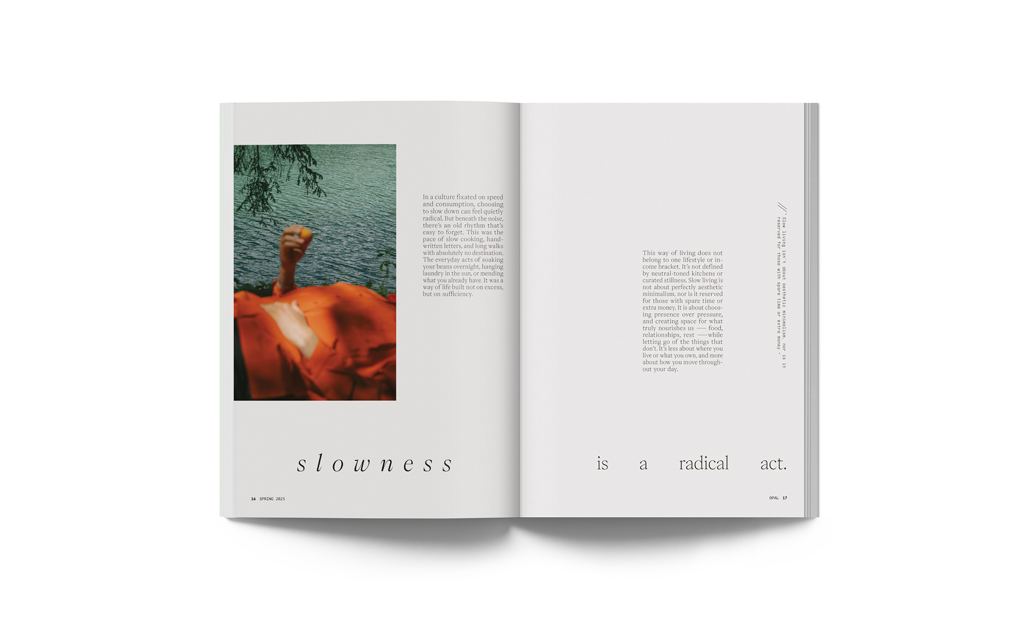
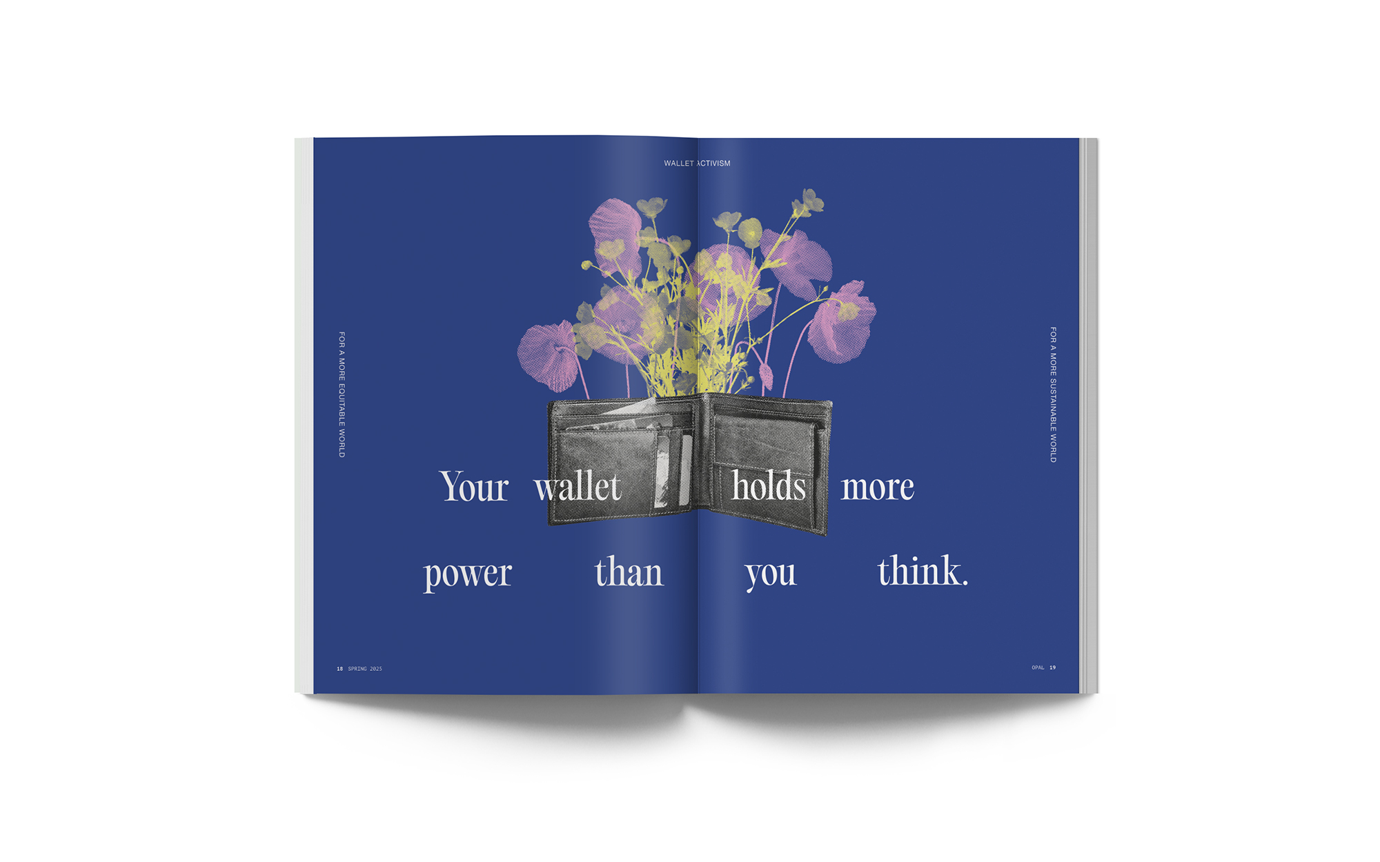
Opal uses immersive photography, earthy colors, and bold typography to create a grounded, tactile feel. The design emphasizes realness over perfection, with spacious layouts that encourage reflection and connection.
Logo
Magazine
Adobe Illustrator
Adobe InDesign
Adobe Photoshop
Optimistic
Approachable
Grounded
Spring 2025



Designed and Developed by Anna Barnett © 2025
